How Creative Beer & Wine Labels Influence Our Purchasing Decisions
How many times have you walked into a store and purchased beer or wine based solely on the fun, creative label design that quickly grabbed your attention?
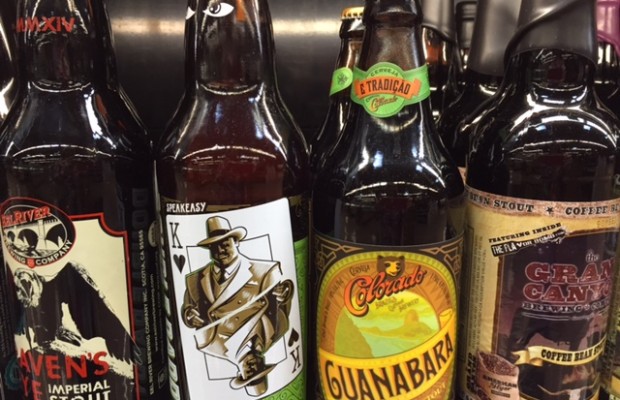
However, there’s more to beer and wine labels than meets the eye. In 2011, Seattle graphic designer, Harvey Shepard, created Oh Beautiful Beer, a blog that “celebrates remarkable graphic design from the world of beer” and wrote a book, Oh Beautiful Beer: The Evolution of Craft Beer & Design. In his blog, Harvey features artistic beer labels that showcase quality design work that he finds visually interesting and appealing to his audience.
“When you look at beer packaging as a whole, the craft sector certainly stands out. Craft brewers are getting innovative with their beers, so it only makes sense that they’re extending that creativity to their visual brand,” shared Harvey.
Harvey said that as beer shelves become more competitive, standing out from the crowd is more important than ever. To quickly catch the consumer’s eye, beer labels need to be clean, clear and scannable.
“If I am unable to process a label with a quick glance, my eye will keep wandering. The Austin Beerworks’ cans are a perfect example. They are bright, bold and simple. You can’t help but pull these out of the store cooler,” said Harvey. “This work from Helms Workshop also stands out as an example of a brewery striving to separate their brand rather than blend in. They went out of their way to avoid the typical beer label clichés with refreshing results.”
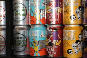
Harvey explained that labels fall flat because they are too complicated. A beer label is a small medium to work with. When bottles have complex illustrations or too much small detail and not enough contrast, the labels appear muddy from a distance.
“That isn’t to say that illustration and detail can’t be done, but it needs to be executed properly. The labels Jeremy Holmes has illustrated for Sierra Nevada (Beer Camp, Estate, Life & Limb) have a tremendous amount of detail,” said Harvey. “However, the overall presentation is striking enough to get it into your hand to investigate further.”
Another beer label on Harvey’s top design list includes Shiner.
“I can’t say enough about McGarrah Jessee’s Shiner work. Shiner beer has been brewed in the tiny Texas town of the same name for over a hundred years. But you probably would have guessed that just by looking at a label,” said Harvey. “Many craft breweries are going with a much more modern and artistic approach to their design, but that just wouldn’t work for Shiner. Their packaging carries all of the personality and history behind their beer.”
22-year-old craft beer enthusiast, John Snodgrass of Parkersburg, West Virginia, is a big fan of sampling new beer styles and brands.
“When I’m trying something completely new that I have zero experience with the label is an eye catcher,” said John. “It has persuaded me to buy this beer versus that beer.”
He pointed out that Miner’s Daughter Oatmeal Stout from Mountain State Brewing Company (West Virginia) has a unique label. The label represents the history of hardworking coal miners of West Virginia and the design showcases the silhouette of a coalminer’s daughter.
Craft brewers aren’t the only ones grabbing the attention of adult beverage drinkers. According to a study by the American Association of Wine Economists, 39.5 percent of consumers ranked label style as the most important when purchasing wine. Identification of the wine ranked second at 29.9 percent followed by bottle color (18.6 percent) and bottle form (12 percent).
An innovative wine brand that’s a favorite among female wine drinkers is Mad Housewife Cellars. Mad Housewife Cellars is all about celebrating women and “was created for busy, multi-tasking women who handle the chaos of their lives with confidence and a sense of humor.” Their wines aren’t intimidating and are affordable for the everyday woman, which is apparent in their recently updated retro label design.
“The old label felt tired and not current. Retro is hot, and we felt that a more retro look and feel better emulated the Mad Housewife character. We also felt it elevated the perceived quality of the wine,” said Susan Butler, VP of Marketing for Mad Housewife Cellars. “It is an excellent wine for the price and the old label didn’t help convey this. We were aiming to increase the vintage look and feel, as well as the perceived value.”
Butler pointed out women respond positively to labels, so it is important to draw their female customers in with an awesome package. Not to mention, it stands out from other wine labels because the design is fun and unique.
So the next time you buy a six-pack of craft beer or a bottle of wine, take into consideration how the packaging and label immediately catch your eye and entices your beer or wine drinking palate.
To browse the beer and wine labels mentioned above, check out the following websites:
Oh Beautiful Beer
Austin Beerworks
Sierra Nevada
Mountain State Brewing Co.
Shiner
Mad Housewife Cellars
Related Posts
 Brewing Beer at Sea: Meet the World’s First Cruise Brewery
 Can You Name All 18 of Anheuser-Busch InBev’s Billion-Dollar Beer Brands?
 25 most important American craft beers ever
 The Wonderful and Unique World of Arizona Beer
 Woody Creek Distillers: Keeping Things Clean for Top Quality
 11 facts about the margarita
You may also like...


-

Craft Beer and BBQ Pairings
Original article can be viewed here. By: AARON GOLDFARB There’s nothing quite like drinking a cold one by a hot grill or smoker. Forget mac ‘n’ cheese or potato salad,...
Warm Beer? Don’t Fear! Give CrushBrew Your Ear We’ll show you a 5min cooling method
By Sam Hill You’re headed to a pool party and you make a stop to pick up your favorite craft beverage to share with your pals. However, you live...


Copyright © 2013 CRUSHBREW.com